ConnectEd
Helping international students navigate their post-secondary institution’s resources & service
Role: Product designer | Duration: 8 weeks, 2022 | Tools: Figma, Otter.ai | Platform: Native iOS | Project Type: Academic
Skills: UX Research, User Interviews, Personas, User Story Mapping, Wireframing, Prototyping, Usability Testing, Mobile UI Design, UI library, Branding
Overview
Introduction
As an international student, it can be difficult to navigate life in a new country. It becomes even more challenging when you're unsure where to turn for help, especially within your own university. In a 2021 study by the Canadian Bureau of International Education, it was revealed that 45.6% of international students had never used any non-academic support services provided by their institution. My objective was to grasp why students weren't taking advantage of these support systems and find a way to assist them.
Solution
International students can search for resources and services offered by their university, from medical insurance to housing tips, while also learning more about what their new country has to offer. Additionally, the forum section helps students get first-hand advice from other students.
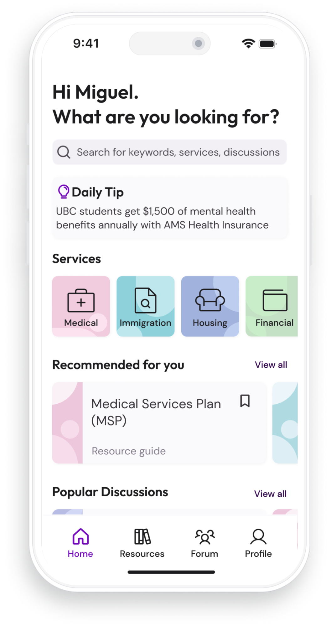
Search For Resources, Your Way
University-specific advice and information, to help you make the most out of your time as a student.
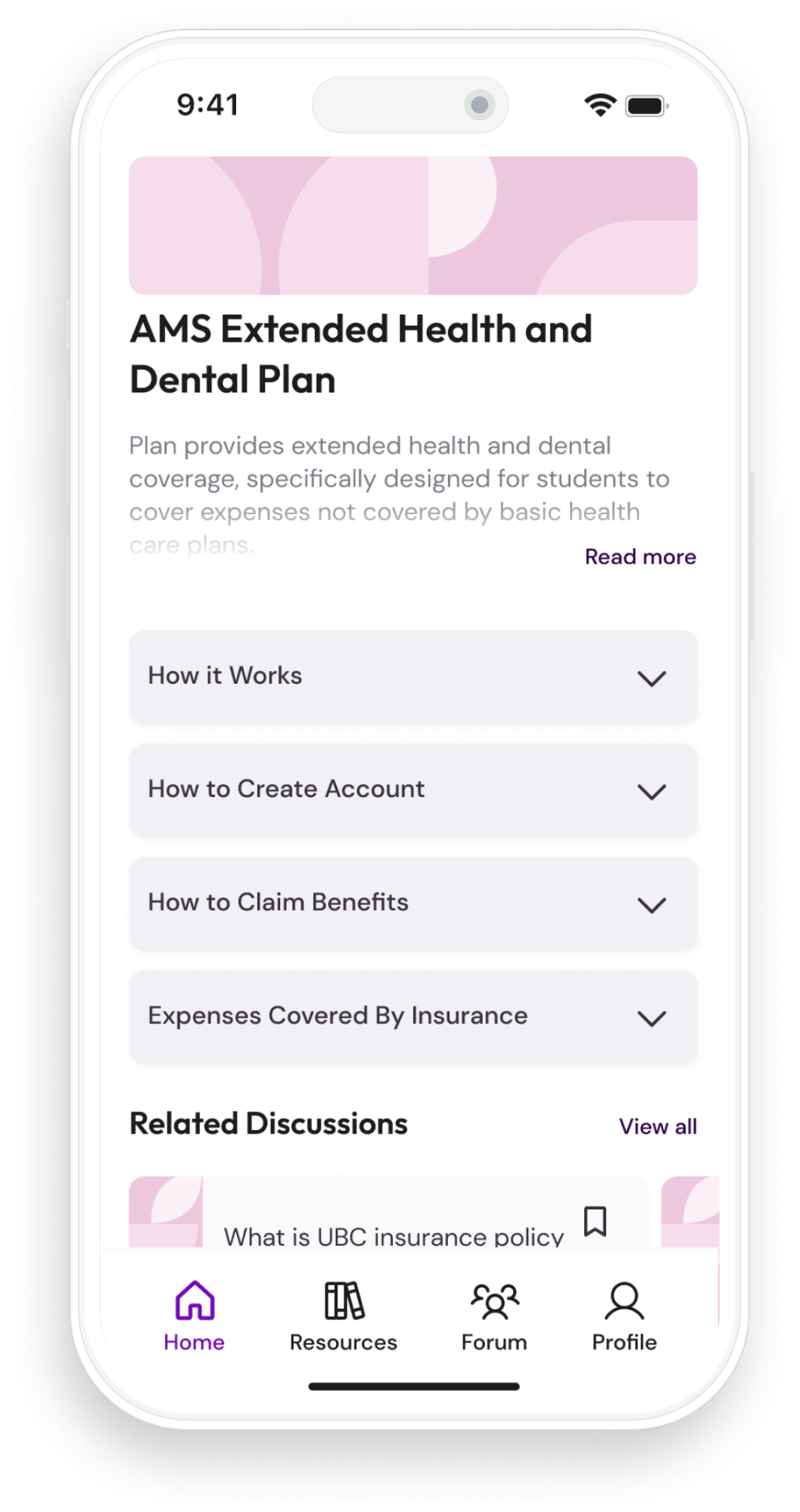
All Your Questions Answered in One Place
Discover your university's resources, learn how to navigate life in a new city, and ask students for advice.
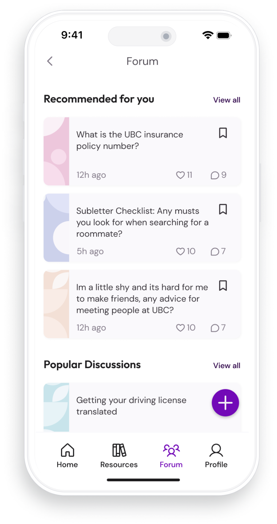
Find A Community That Will Help You Succeed
In the forum, find answers and support from other students. Ask for advice about what resources are best for you.
Research
The following research by the Canadian Bureau of International Education reflects international students’ satisfaction with institutional services:
45.6%
55%
50% +
61.7%
Had never used any non-academic support services
Lack confidence in the reliability of these services
Did not know where to find housing assistance
Had never used counseling or mental health services
Post-secondary institutions offer non-academic support services to international students, but students are often unaware or hesitant to use them.
User Interviews
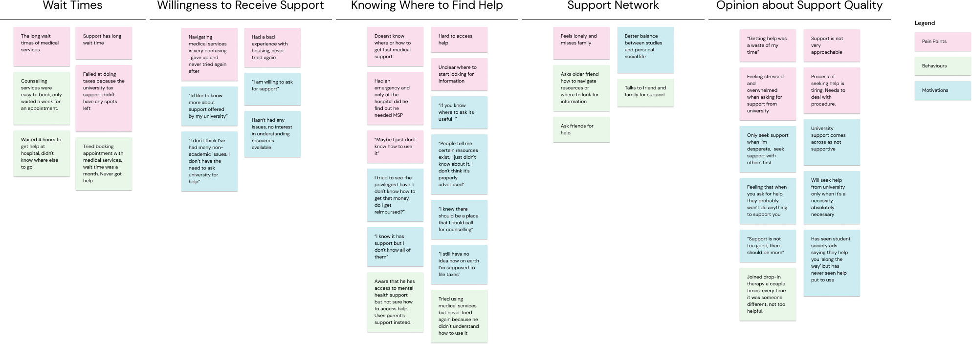
To understand international students’ opinions towards institutional support services and why they seek or avoid these services, I conducted user interviews. I learned that students were unsure how to access the resources available at their university, causing frustration towards their institution and the services offered. Below is a synthesis of my insights.
Participant Criteria: An international student who moved to Canada to study, ages 18 to 25, and currently attending a post-secondary institution that provides non-academic support services.
Research Method: User interviews
Research Goal: Understand if participants have sought help from their institution and if they have used non-academic services yet.
Number of Participants: 4
Research Findings
My user interviews unveiled the following pivotal themes:
Willingness to Receive Support
The user is willing to ask for support and learn more about the resources available at their institution.
Not Knowing Where to Find Help
People are confused about how to access available resources, despite knowing that they exist.
Negative Opinion about Support Quality
The user has a negative perception of the support offered by their institution.
Not Knowing Where to Find Help
Users value the advice from friends and family. Having a strong network helps them feel supported.
Long Wait Times
Users are also discouraged by the long wait times associated with seeking help.
Define
Research Findings
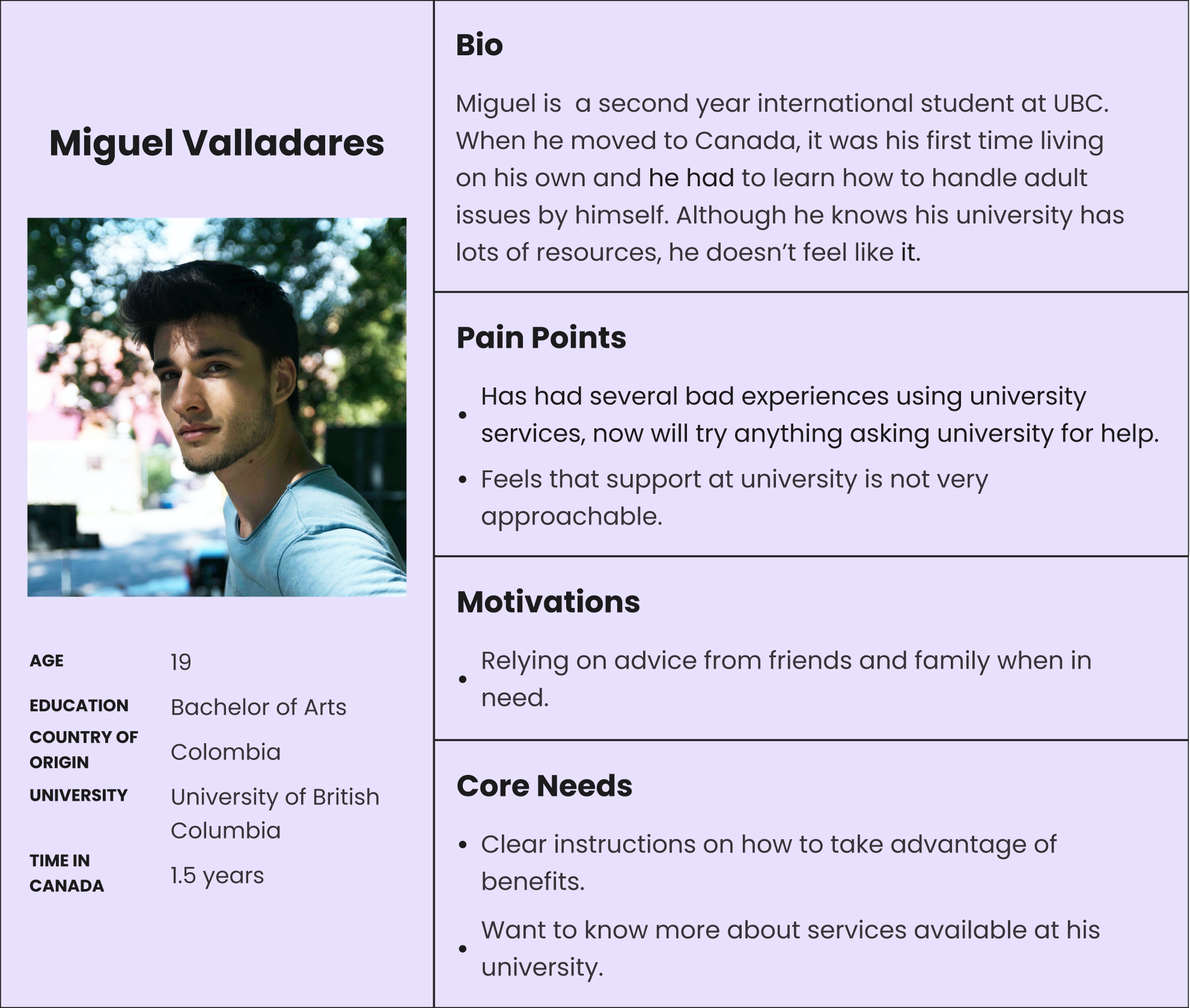
Miguel serves as the embodiment of my users, guiding all my design decisions. My persona, shaped by extensive research findings and interviews, revolves around his needs and aspirations.
Ideation
Sketching a Solution
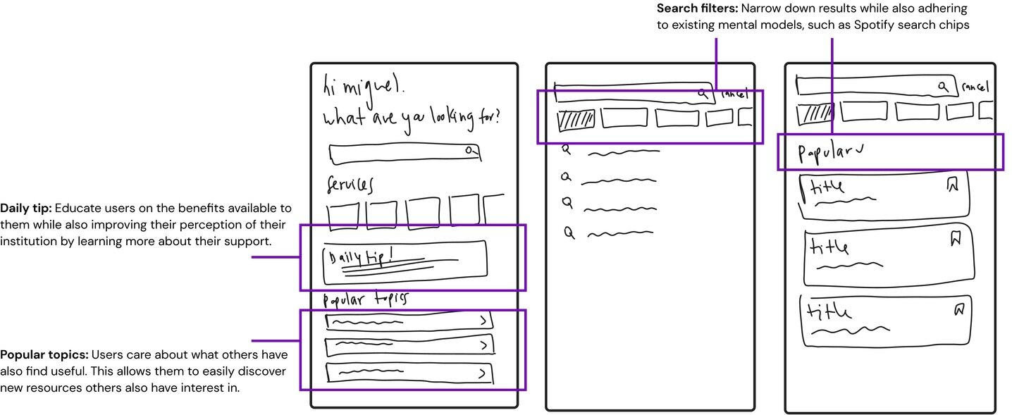
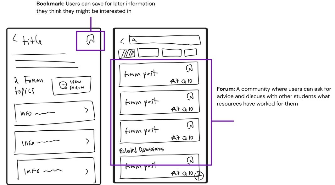
Based on Miguel's needs and mental models, I began brainstorming, first on paper, then digitally. Here are my initial lo-fi wireframes, highlighting features I included.
Optimized Task Flow
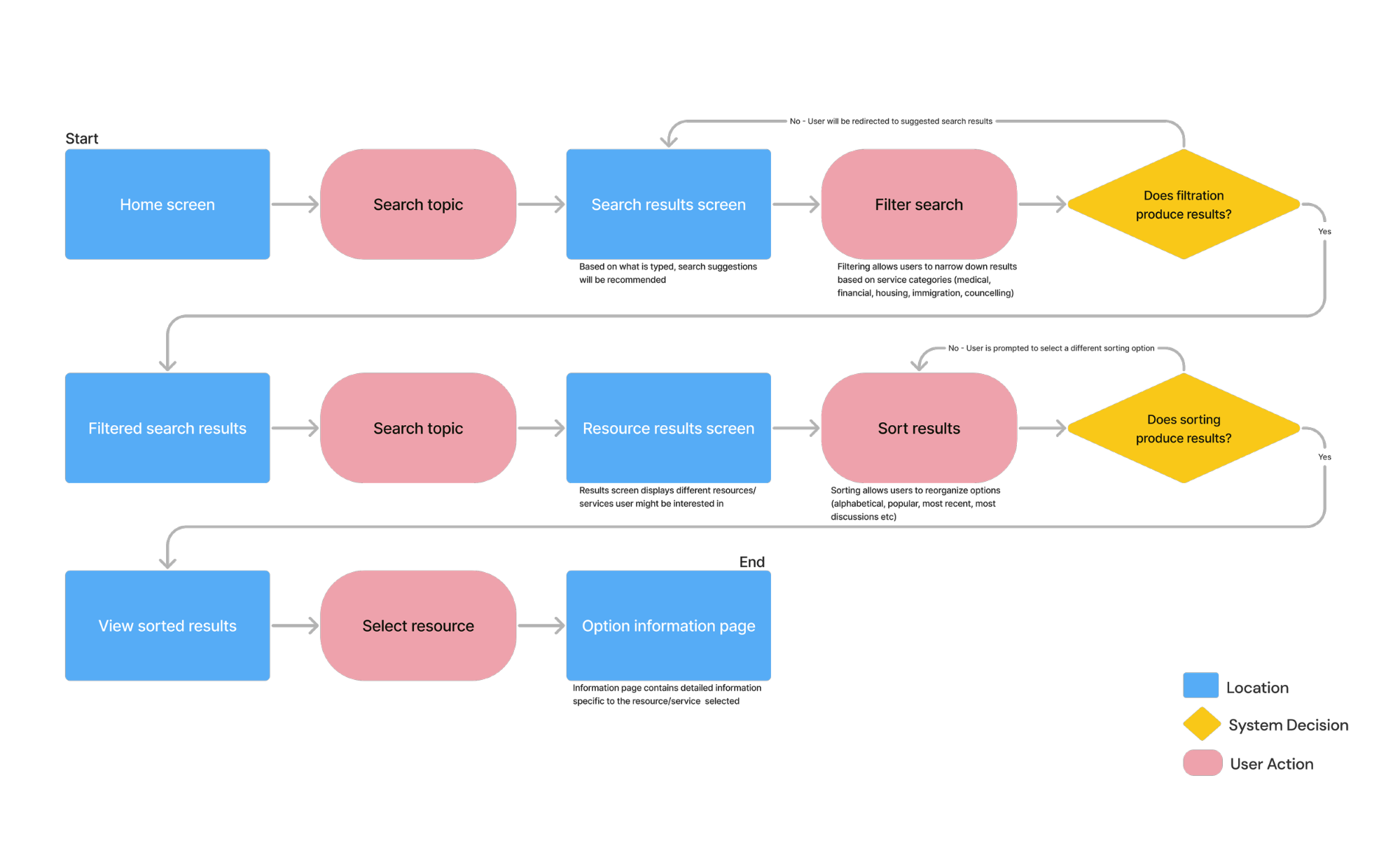
In the past, Miguel has struggled to find information and determine if it is best for him. This new task flow indicates what his experience would be now as he searches for the information he wants. Miguel can search for what he needs, knowing that it’s tailored to him as an international student at UBC.
Iteration
Iterating Through Testing
With my wireframes ready, I conducted two rounds of user testing with 5 participants each to determine major usability issues. With these iterations, my goal was to keep Miguel at the forefront of all my design decisions. The following are some changes made.
Home Screen Hierarchy
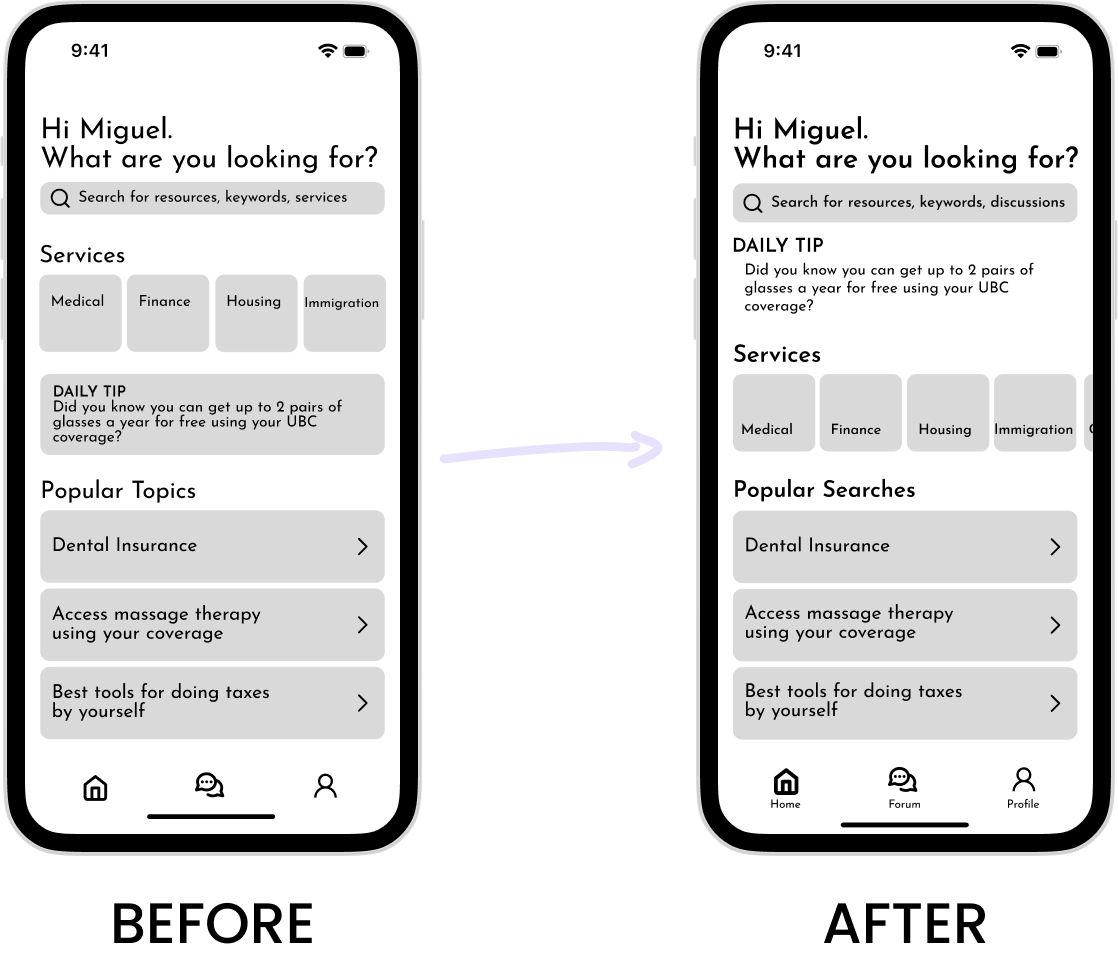
- Improved screen hierarchy, prioritizing the information that is most beneficial to Miguel
- Moved “daily tip” since participants mentioned that the positioning broke up the flow
Forum Functionality
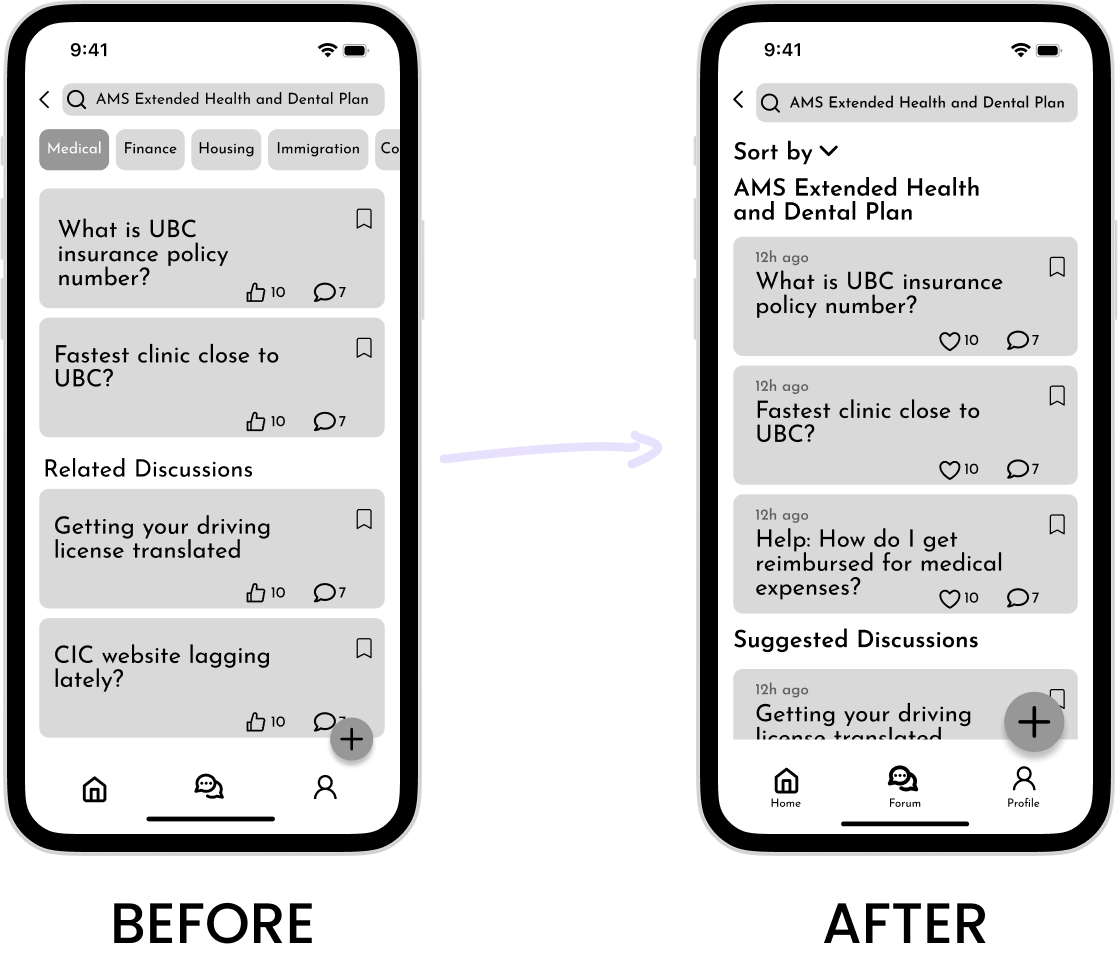
- Enlarged FAB button to simplify creating new discussions.
- Improved consistency by replacing chip-style sorting with bottom-sheet sorting.
- Updated cards, added timestamps to indicate relevance, and changed "thumbs up" to "like".
- Updated title of "related discussions" section to clarify its purpose.
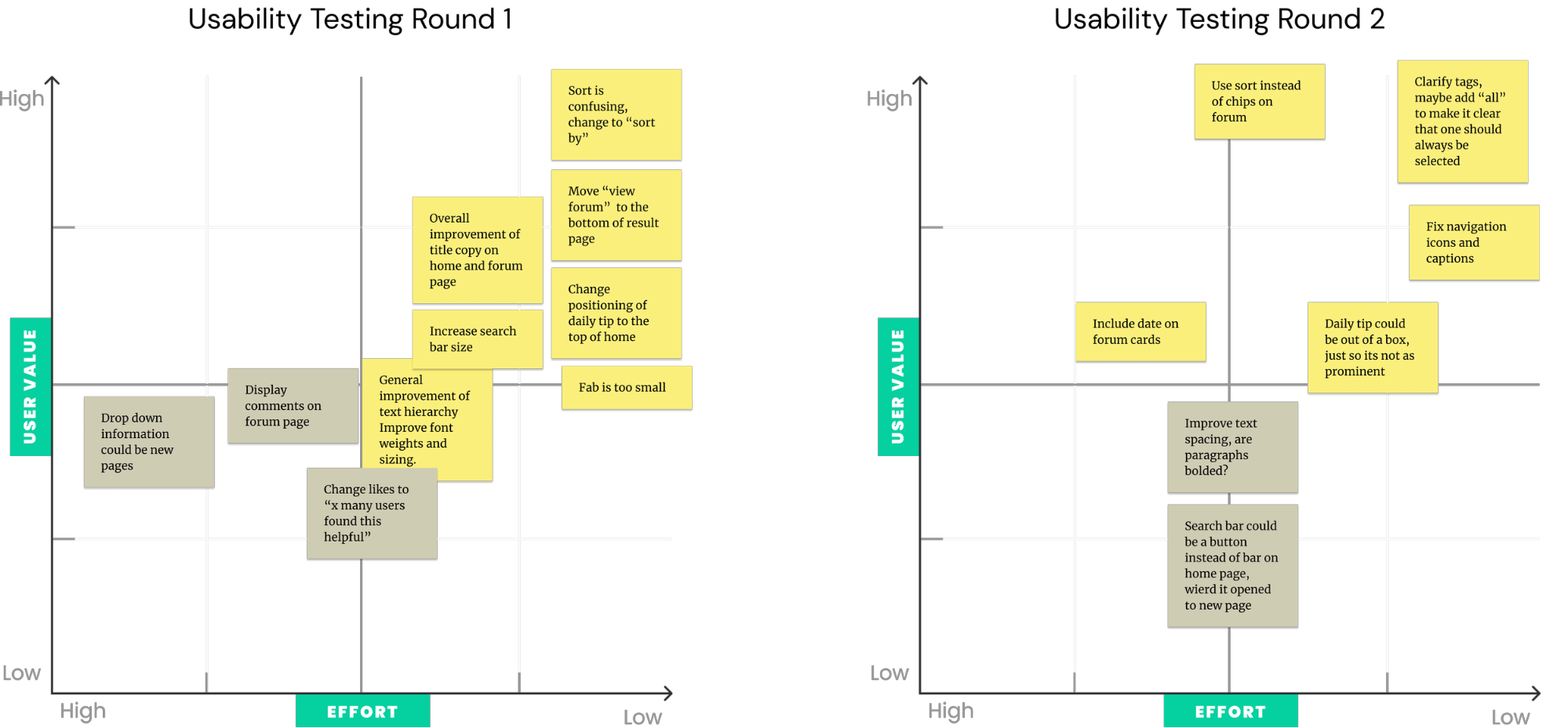
Prioritizing Changes
Using a prioritization matrix helped me organize each round of feedback and evaluate which improvements aligned most with user goals.
Style Guide
Accessibility Considerations
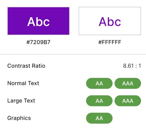
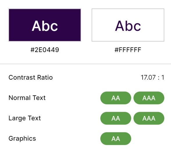
While defining my app color palette, I tested my primary colors used to confirm they passed WCAG 2.1 accessibility standards. Designing with inclusivity in mind is key to providing a smooth experience, regardless of your background. This consideration extended beyond the color palette to encompass the selection of icons and typefaces as well.
Branding
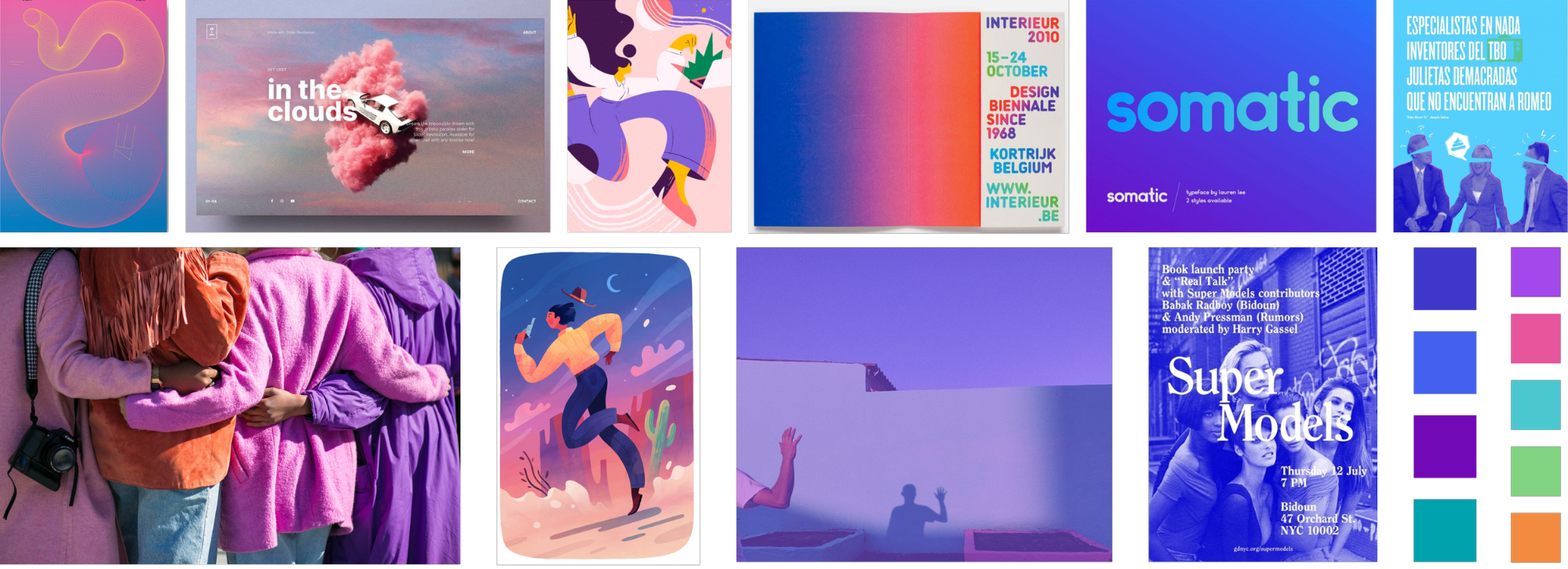
When crafting my app's brand identity, I aimed to blend information and approachability seamlessly. Catering to a youthful university demographic, it had to exude a vibrant energy while remaining a dependable tool for students. The accompanying mood board embodies my chosen style.
Vibrant, approachable, curious, open-minded
A Name To Tie It All Together
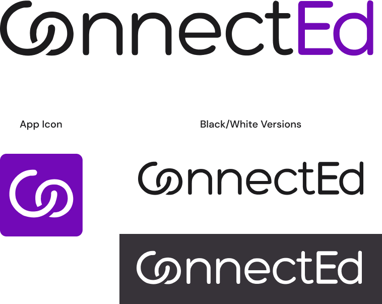
"ConnectEd" is the ideal name for my brand, cleverly merging the words 'connection' and 'education'. It reflects my goal of linking students with institutional services, emphasizing the importance of being informed within your community.
Designing For Scalability
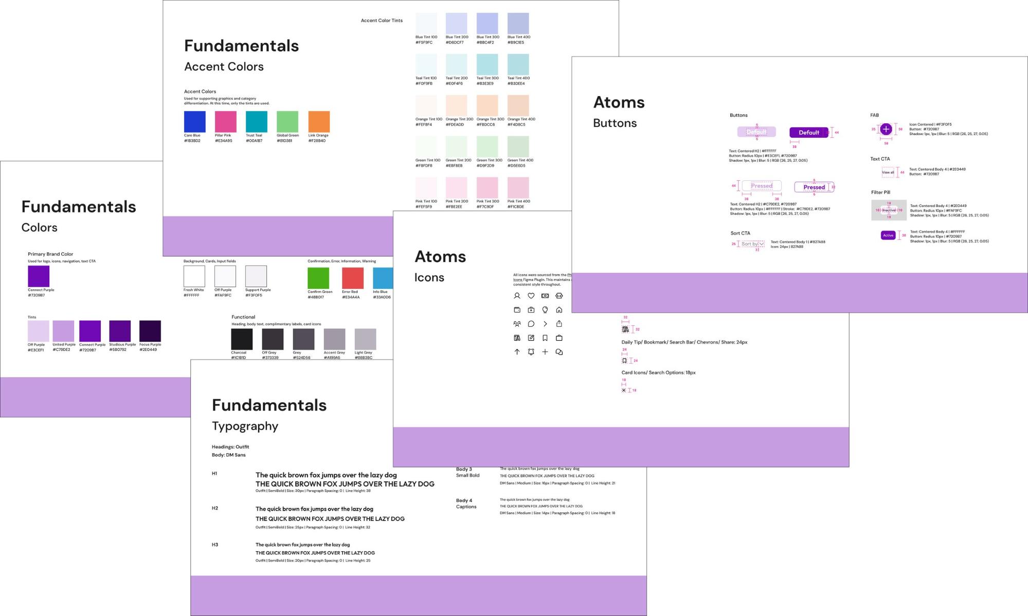
To ensure consistency and set up ConnectEd for success, I developed an atomic design system. This system provides clear guidelines on efficiently using the various components within ConnectEd.
Final Design
Finalizing ConnectEd
After finalizing the branding, it was time to create a high-fidelity prototype. Feel free to check it out.

Home page: Empower students with essential information on topics and benefits, providing easy access through intuitive categories.
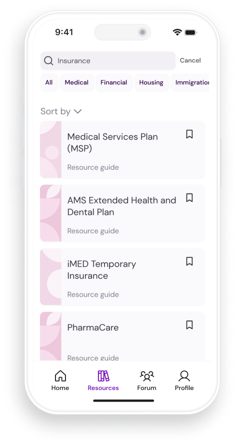
Search: Tailored results for students based on their institution, with filters for a more personal exploration.

Resource Page: The app's intuitive design simplifies discovering and learning new essential information for students. Explore related forum discussions through the bottom section.
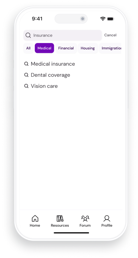
Recommended Results: As you type, the search function suggests related topics, enhancing the speed and ease for students to find relevant assistance.
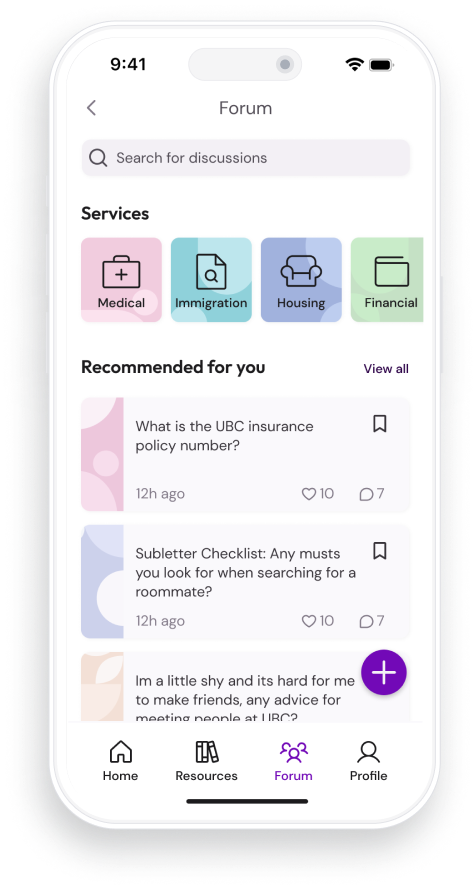
Forum: A community-based resource for students seeking direct advice and support. Browse existing discussions or post your own.
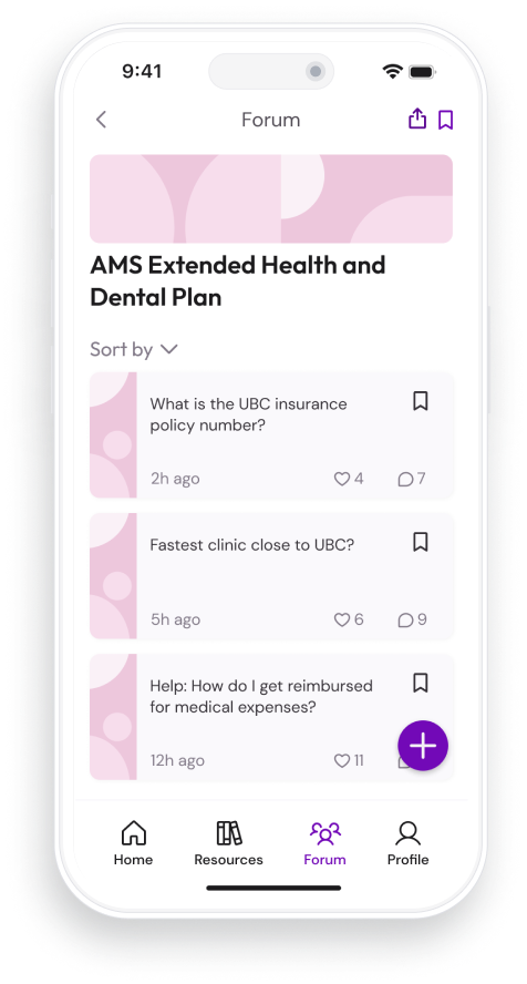
Forum Topics: Discussions can be organized under specific subjects, making it easier to find related conversations and quickly locate answers within the community.
Metrics to Consider
To comprehensively evaluate the effectiveness of ConnectEd, the following factors can be assessed:
Improved Academic Performance:
- Grade Improvement: Measure the impact on the academic grades of international students using ConnectEd.
- Retention Rate: Assess whether the platform contributes to higher retention rates among students.
Utilization of Resources:
- Overall Increase: Evaluate if there is a notable increase in the overall utilization of university resources by international students.
- Diversity of Resource Use: Explore whether ConnectEd encourages students to access a broader range of available resources.
Forum Activity:
- Engagement Metrics: Analyze forum engagement metrics to understand how effectively the platform fosters discussion and collaboration.